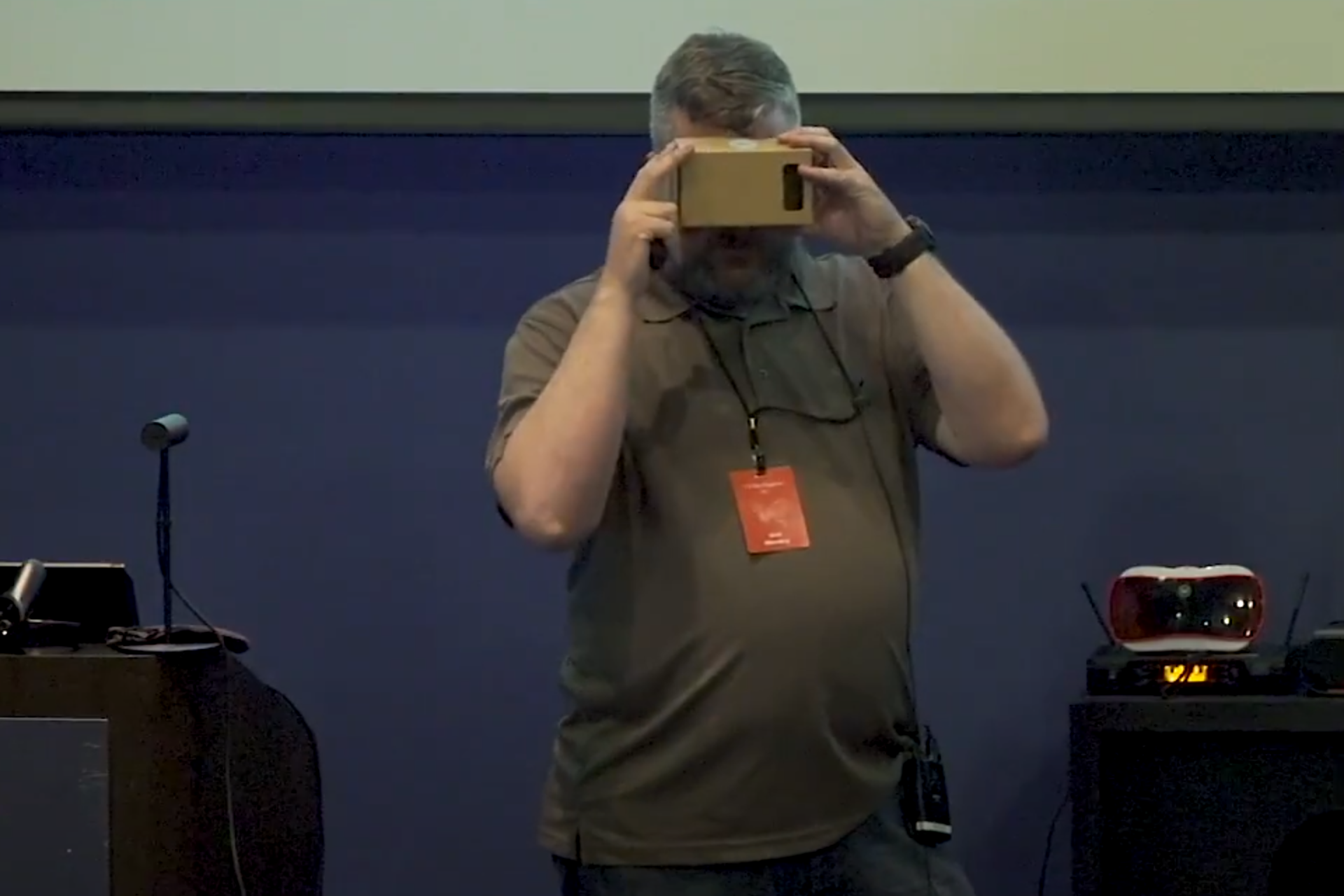
VR Crane Training & Practice Simulator
I recently finished XR Terra's 12 week AR & VR Developer Program, which taught us how to use Unity to build AR and VR games and applications.
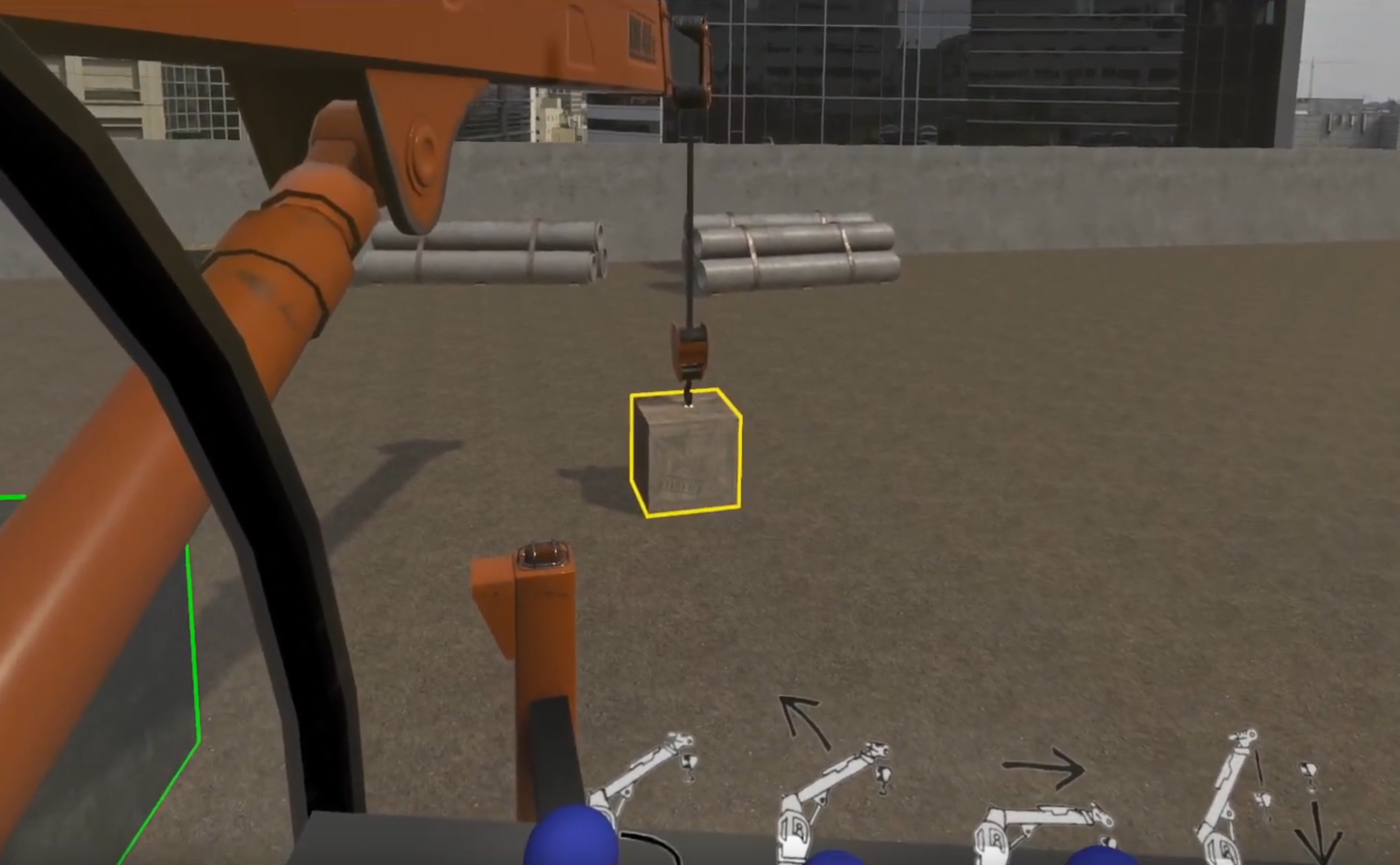
The VR Industry project was to create a crane simulator.
Results
Trainee learns each of the crane controls
A timed and scored session with no instructions or hints
Multi-lingual supports was added, all instruction has been translated
Team
I was a member of Team 2, which consisted of 4 of us. My roles were as follows:
- Project setup - getting the project setup with Unity's XR plug-in framework
- UX & User flow - how the application would look and function
- Environment - building out the construction yard scene
- Scoring - identifying when the cargo was placed on the target and establish points
- Audio - 3D spatial sounds, audio mixing and environmental sounds
- Language framework - develop an easy system for identifying English or Spanish content
- Internal testing - there can never be enough play testing
- Debugging - run/test/log errors and then fix those errors
- Image editing - editing assets outside of Unity
- VR video capture - Capturing the output while running the application
Use Case
Since cranes are expensive and dangerous, we were tasked with creating a VR crane simulation that a new trainee could practice on.
Goal
In order to successfully train the user, they need to be able to complete the following tasks:
- Start the crane engine.
- Deploy the crane arm.
- Lift an object.
- Move object to designated target.
- Place the object on the target.
- Turn off the crane engine.
- Track the amount of time it takes to complete the entire set of tasks.
- Track how close the object is placed to the target.
Requirements
Three of the four members of our team owned Oculus Quest headsets so we chose the Quest as our specific hardware target. (The fourth member did not own a VR headset.)
Planning
After watching several YouTube crane instruction videos, our team discussed what the overall flow would be for the application.
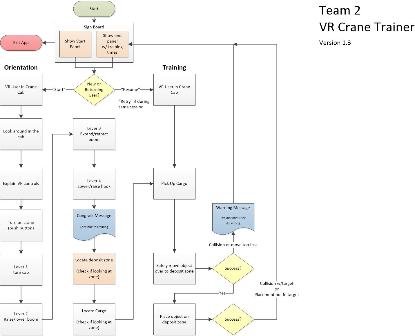
I created a user flow diagram which served as a blueprint to build the application. This diagram aided in identifying any potential issues or program logic that would have to be reworked.
After a few iterations, the diagram shown above was finalized.
Design
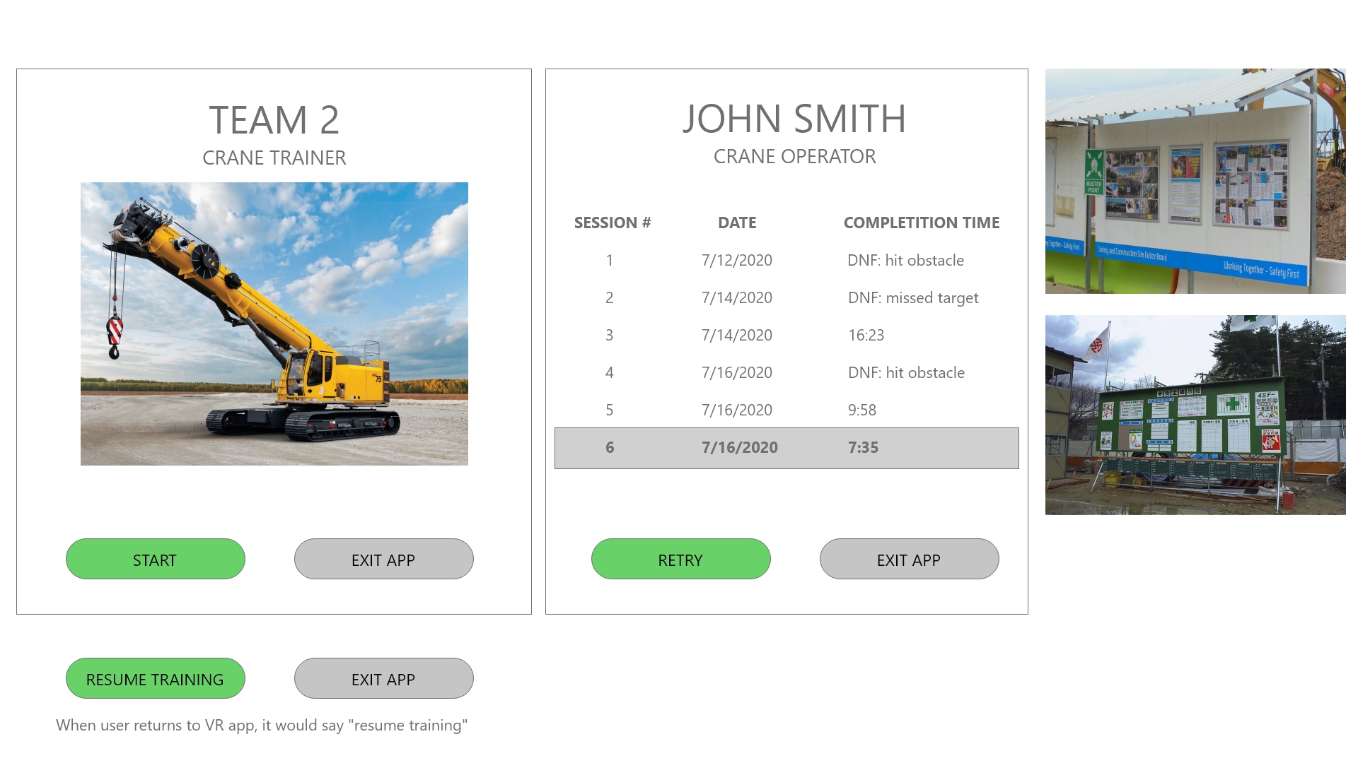
I sketched up some start screens in Adobe XD, getting inspiration from information and safety boards that are posted at construction sites.
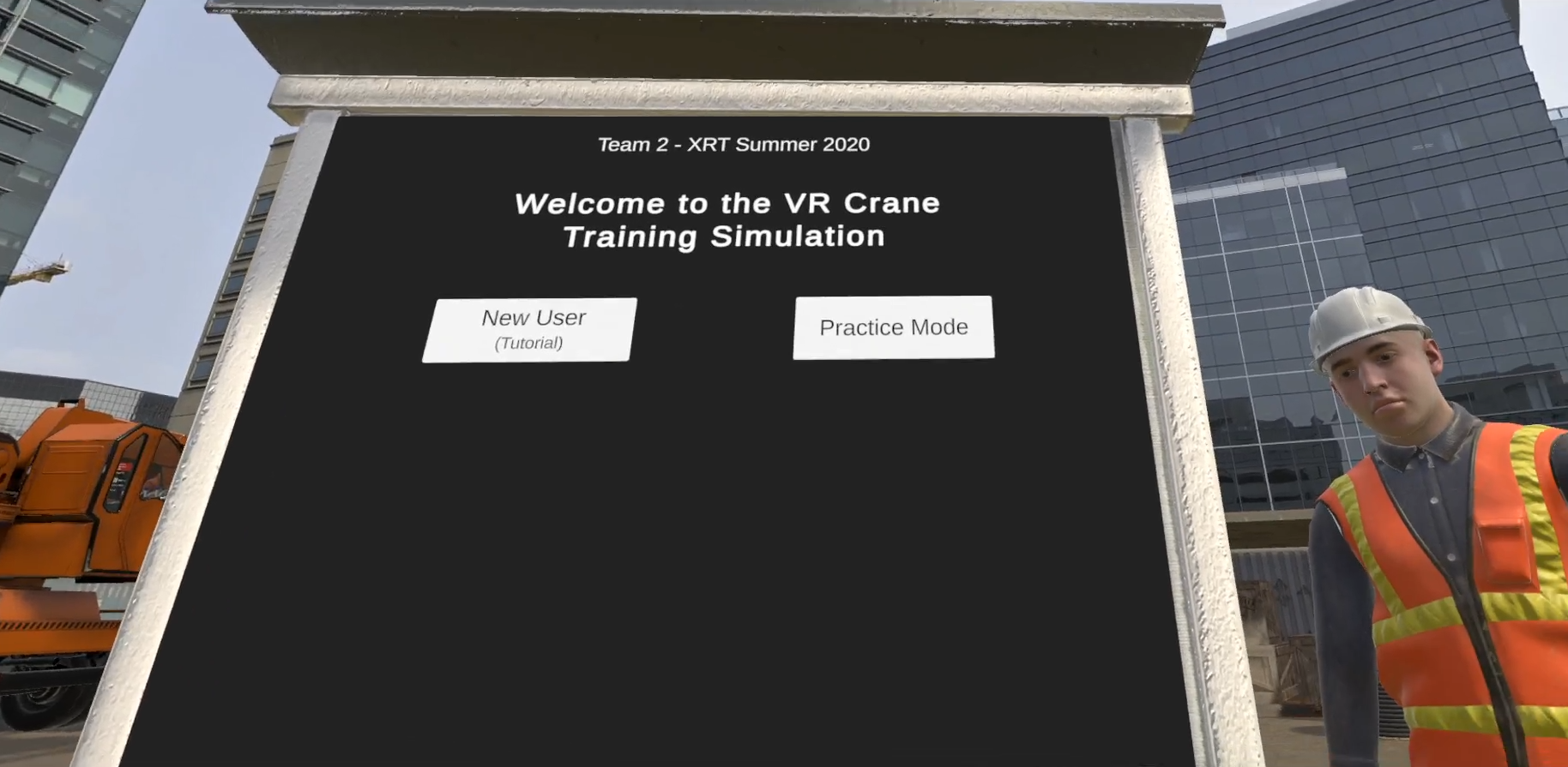
The result was signboard that served as the Start and End screen location in the application. UI elements were:
- New User (Tutorial)
- Practice Mode
- Language Selection
- Session Results - shown after Practice Mode was run
Development
Software Used
VR Development
Unity (2019.4.2f1) - VR development
GitHub - code repository
GitKraken - Git client
Rider - C# editor
Planning & Design
Xmind - mind mapping, used primarily in kickoff to take notes and record ideas
Viso - Application flow
Adobe XD - UX design, page layout, user flow
2D & 3D Graphics
Photoshop - icons, texture maps
Blender - 3D assets
Audio
Audition - audio clips and loops
Video
Open Broadcaster Software (OBS) - video capture
Premiere - video editing
Collaboration
Zoom - video chat
Slack - text chat
Google Drive - store and share additional assets with the team
Google Sheets - create matrix of onscreen text for translation and tagging
Google Presentation - for our final presentation
Difficulty Zone
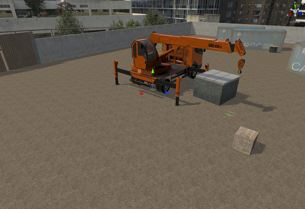
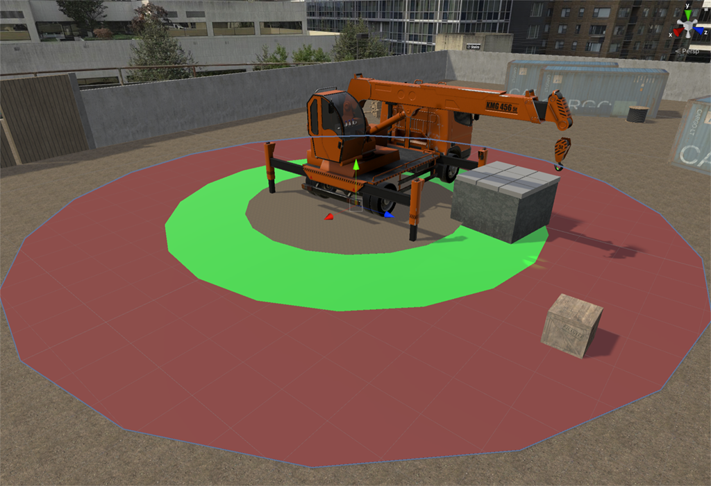
While designing the environment, I decided to create 2 circles that represent the range of the crane.
The red circle is the range of a retracted and extended boom arm when it's fully lowered. This would be considered 'easy'.
The green circle represents the boom arm fully retracted and lowered to fully raised (while retracted). This would require extra maneuvering from the operator and would be considered 'hard'.
By toggling the zones on, I could place the cargo and target in different areas on the circles thus changing the difficulty. A future update would be to have it randomly place the objects based on a difficulty selection, also ensuring the objects are at least 90 degrees from each other to make the operator rotate the crane more and look around.
And yes, the colors should probably be reversed but this is only viewable in the Unity editor.
Additional Features
Environment
- Panoramic image skybox
- Construction yard models
- High quality crane model
- Ambient sounds (construction yard and city)
- Functional side view mirror (reversed camera)
Effects
- Post processing (mixers) of audio in cab
- Interior location has ambient sounds muffled
- Narration audio processed to sound like two-way radio
- Sound effects for crane motor, hydraulics, winch, safety beep, and Tutorial target
- Particle effects on Tutorial targets to aid in identification
User Experience
New User Training Mode
- Teach user controls
- Only one control active per step
Multi-Lingual Framework
- User selects language at start and it's applied throughout experience
- Text elements have a language tag global selection
- Appropriate narration audio file loaded
Instructor Feedback
Excellent use of pre-made assets.
Magnet/hook swaying is a weird corkscrew pattern. Something is wrong with the PhysX joint, but that's a difficult thing to fix.
Excellent use of an in-simulation training.
Great use of UI sound effects for completion.
Clever use of Spotlight to highlight hook location.
With your glass dome cockpit, some viewers may get a slight headache from it. Consider adding comfort settings such as a vignette.
Ditch human models unless you have a use for them. I understand, you did explain you had an idea of uses but didn’t get to them.
Great use of environmental audio.
Love the decision to include an additional language.
Score: A
